
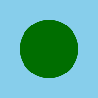
Two of my favourite flags are Greenland and Somalia, so it's perhaps not a surprise that the first design I suggested was a white circle on a light blue background:

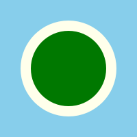
That was pretty enough, and simpler - we also decided to go for a 1:1 aspect ratio to make it a little different from most national flags. But it still used a blue-and-white colour scheme.
The same but with green instead of white fixed that, but looked rather muddy.
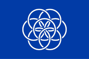
We finally settled on these two designs, which we like about equally much. The ring creates a boundary that lets us use more colours, and it also represents the planet's surface and atmosphere. Aesthetically, we both prefer the first one, but the second one may be more universally appealing - especially given that black is not a popular colour in flags at all.

Next, we wanted to also design a flag for our solar system. For it to represent our particular one rather than any solar system, we felt it needed to include some details of what ours looks like. Our first attempt was a ten-stripe flag, with eight stripes representing the planets and one each for the asteroid belt and dwarf planets.

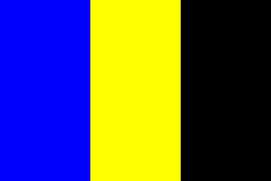
This ended up being just plain too complicated, so we started simplifying, ignoring the planets except for Earth and Jupiter. Why Jupiter? Because without its mass protecting the Earth from impacts, we'd be in rather worse shape! The first version was this simple tricolor of blue, yellow and black, for Earth, Jupiter and space.
We then switched to trying out concentric designs like the Earth flag, and finally settled on this one, with the yellow circle representing Jupiter and the white one Earth:

Finally, we also made the worst possible flag for Earth we could think of. We took a world map, got rid of some random islands that tend to get left off maps, rotated it to center on the US, cropped it, made it an eye-watering green-on-blue, and finally added a mis-spelled motto of highly awful origins.